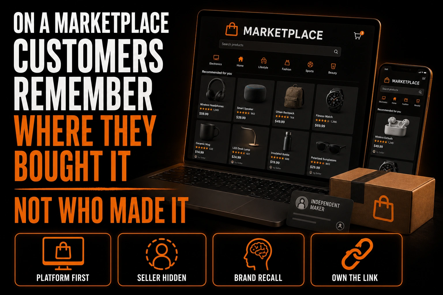
On a Marketplace, Customers Remember Where They Bought It, Not Who Made It
The sale that does not build your brand
Ask one of your customers where they bought your product. If you sell through a marketplace, there is a good chance the answer is the name of the marketplace.
Not your shop name. Not your brand. The platform.
This is not because your customer was inattentive. It is because almost every memorable moment of that purchase belonged to someone else. The search happened on the platform. The reviews were the platform’s. The checkout, the confirmation email, the shipping notification, the return window and the customer service conversation all carried the platform’s name, its colours and its typography.
Your brand appeared once, in small type, on a seller line most buyers never read.
For a company selling through its own site, every transaction reinforces the brand. For a company selling through a marketplace, most transactions reinforce someone else’s. That difference compounds quietly over thousands of orders, and it explains why a shop can do real volume for years and still have no recognition off the platform.
What this guide does not cover
Three neighbouring subjects have their own articles on this blog and there is no reason to repeat them here.
The design of a storefront sign, and the mistakes that make a physical shopfront hard to read, are covered separately. This article is about an online shop that has no street presence at all.
Packaging and label design as a discipline, including hang tags and clothing labels, has its own coverage. Here, packaging appears only as one of three surfaces, and only for what it does to brand memory.
Finally, this article does not tell you how to move customers off a marketplace and onto your own store. Marketplaces generally restrict that, in ways described below, and the point here is different: how to be remembered by someone who stays on the platform.
Where your brand appears, and where it does not
It helps to be blunt about the split, because most sellers have never listed it out.
Surfaces the platform controls. The search results page. The layout of your product page. The checkout. Every automated email. The invoice. The return process. The review interface. On some programs, even the shipping box. You cannot design any of these, and together they represent the large majority of what the customer actually experiences.
Surfaces you control. There are three, and only three: your product photography, the product itself, and whatever goes inside the package.
That is the whole inventory. Everything your brand will ever do on a marketplace has to happen in those three places, which is why they deserve far more attention than most sellers give them.
The photograph is doing the work of a storefront
Your main product image is the single most important brand asset you have on a marketplace, and it is usually treated as a technical requirement rather than a design decision.
It appears in the search grid beside a dozen competitors, at a size no one chose, cropped to a ratio the platform imposes. It is the only thing that distinguishes you before a click. And unlike a website, you get no header, no navigation, no colour scheme and no typography to carry your identity.
The practical consequence is that recognisability has to live inside the photograph itself. That means a consistent way of shooting every product in your range: the same background treatment, the same lighting direction, the same angle, the same relationship between the product and the empty space around it. A buyer scrolling a category should be able to tell two of your listings belong together without reading either title.
This is a stricter discipline than most brands apply to their own website, precisely because none of the usual supports are available. It also happens to be free. Consistency of framing costs nothing beyond deciding on it once and writing it down.
The product is where recognition actually sticks
Whatever the platform controls, it does not control the object in the customer’s hands.
A mark on the product, a distinctive closure, a recognisable shape, a colour that belongs to you: these survive the transaction. They are what a customer photographs, shows a friend and looks for again. A brand that exists only in a seller name will not be recalled, because a seller name is read once, at most, and never seen again.
This is why a mark designed to stay legible when it is small matters more for marketplace sellers than for almost anyone else. The places your logo appears are a thumbnail and an object, and both are unforgiving. A logo designed for those two placements is a different brief from one drawn for a website header.
The insert, and the rule you have to check first
The third surface is whatever you put inside the box, and this is where sellers most often get themselves into trouble.
Marketplaces generally restrict attempts to divert a buyer off the platform to complete a transaction elsewhere. The specifics differ by platform and they change, so treat the current terms of your own marketplace as the authority and read them before printing anything. This article deliberately states no rule, no threshold and no penalty, because the policy pages that would settle it could not be retrieved at the time of writing.
What that restriction means in practice is a design constraint rather than a prohibition. An insert that says thank you, explains how the product is made, tells the reader how to care for it or identifies who made it is doing brand work without asking the customer to go anywhere. An insert whose purpose is to redirect the sale is a different thing entirely, and it is the kind that gets accounts into difficulty.
The useful reframing is this. The insert is not a coupon. It is the only piece of your own writing the customer will ever read, and it is the one moment in the entire transaction where your voice is not competing with the platform’s.
A brand built for a thumbnail and an object
We design identities for sellers who do not control their own storefront: a mark that holds at thumbnail size, a compact version for the product itself, and a consistent photographic treatment that makes your listings recognisable as a set.
What a marketplace-ready identity needs
Four things, in the order they matter.
- A mark that survives a thumbnail. Not a reduction of a wide logo, but a version drawn for small square use.
- A photographic rule written down. Background, lighting, angle, crop, spacing. One page is enough, and it is what makes a range look like a range.
- Something on the object itself. A mark, a colour, a form. Whatever a customer could point at.
- A short piece of writing for the package. Who you are and why the product is the way it is, with no call to leave.
Notice that only the first is a logo file. The other three are decisions, and they are the ones that get skipped. That is also why a strong visual identity works through repetition rather than through a single clever mark: recognition is built by seeing the same thing in the same way, many times.
A five minute check
Open your own shop as a stranger would.
- Look at your listings in the category grid. Can you tell they are yours without reading the titles?
- Zoom your main image to thumbnail size. Is anything of your brand visible?
- Pick up one of your products. Is there a mark on the object?
- Open a package. Is there anything inside with your name on it?
- Read your seller name as it actually displays. Does it say what you make?
Most sellers fail three of these five, and the fixes for all of them are cheaper than a week of advertising. If the first two fail, the problem is the mark itself, and redesigning the logo is the step that unblocks the rest.
Cheat sheet
- On a marketplace, the platform owns nearly every memorable moment of the purchase.
- You control exactly three surfaces: the photograph, the product, the package insert.
- The main product image is functioning as your storefront. Treat it as a design decision, not a file spec.
- A written photographic rule makes a range recognisable, and it costs nothing.
- A mark on the object is what survives after the order is forgotten.
- Marketplaces restrict driving buyers off-platform. Read your own platform’s current terms before printing an insert.
- An insert that explains, thanks or identifies does brand work. One that redirects the sale creates risk.
Frequently asked questions
Why do my customers not remember my brand name?
Because they were never really shown it. On a marketplace, the seller name appears in small type on a page dominated by the platform’s own interface, and it does not reappear in the confirmation email, the invoice or the shipping notice. Recognition requires repetition, and the marketplace gives your name almost none.
Is a logo even useful if the platform controls the page?
Yes, but it has to be the right kind. On a marketplace your logo lives in two places only: a thumbnail and the product itself. A wide logo with fine detail fails in both. A compact mark designed for small square use works in both, which is a different design brief from a website header.
Can I put a card in the box inviting customers to my own website?
Check your platform’s current terms before you do. Marketplaces generally restrict attempts to move a transaction off-platform, and the details differ and change. A card that thanks the buyer, explains the product or tells them how to care for it is a different proposition from one whose purpose is to redirect the sale.
What is the cheapest change with the biggest effect?
Writing down a photographic rule and applying it to every listing. Same background, same lighting, same angle, same crop. It requires no new design work, and it is what makes a buyer recognise your second listing after seeing your first.
Should my seller name describe what I make?
If the platform allows you to choose it, yes. Your seller name is often read without any visual support at all, which means it has to carry meaning on its own. An opaque name in that position tells the buyer nothing.