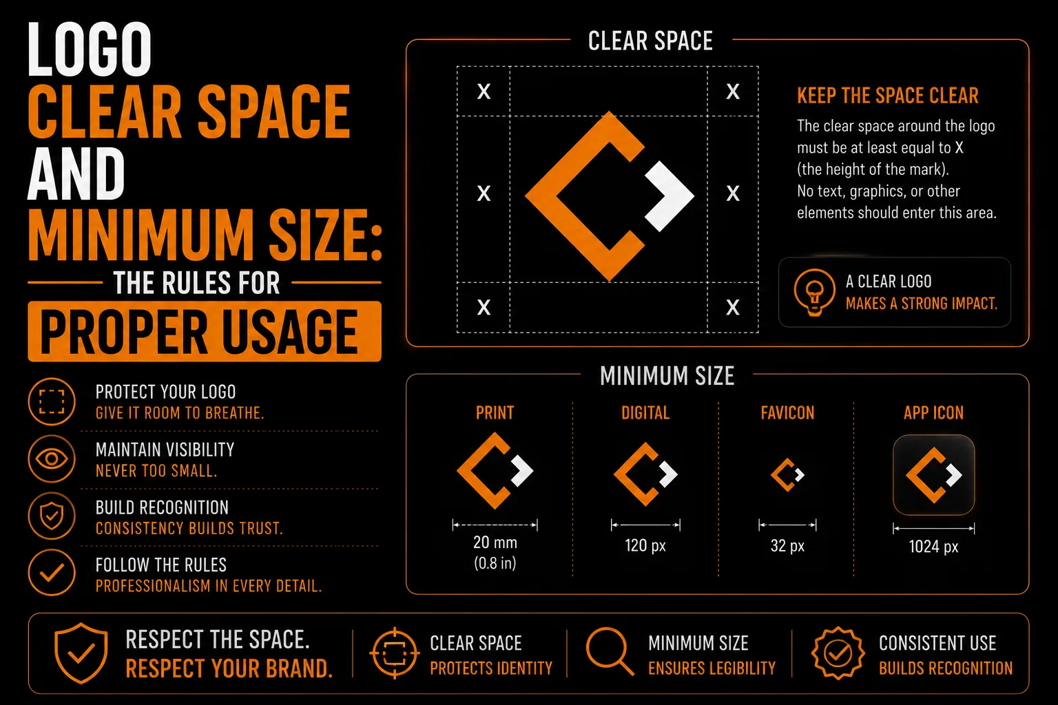
Logo Clear Space and Minimum Size: The Rules for Proper Usage
Logo clear space keeps nearby content from crowding your mark; minimum size defines how small each version can remain legible. Both should be tested on real applications, rather than copied from another brand. Ask for separate guidance for print and screens, including an icon or simplified version when the full logo becomes unreadable.
What is logo clear space ?
Clear space, sometimes called exclusion zone or safe area, is a defined margin of empty space that should always surround your logo. Nothing, no text, images, edges or other logos, should intrude into that zone. The purpose is to give your logo room to breathe so it stands out clearly and is not crowded or competing with surrounding elements. A common way to define it is to use a measurement based on part of the logo itself, such as the height of a letter, so the margin scales naturally with the logo.
Why does clear space matter ?
When a logo is crammed right up against other text, images or the edge of a page, it looks cluttered and amateur, and it loses impact. Clear space ensures your logo always has a clean frame of breathing room, which makes it feel confident and professional. It also improves recognition, because the logo stands apart from its surroundings. This small rule is one of the easiest ways to keep your brand looking polished across every layout and application, from a business card to a billboard.
How is minimum size defined ?
Minimum size is the smallest your logo should ever be reproduced while remaining clear and legible. Below that size, fine details merge, text becomes unreadable, and your logo turns into a smudge. Defining a minimum size, often expressed in pixels for screen and millimeters or inches for print, prevents your logo from being shrunk into illegibility. If you need your brand smaller than the minimum, that is exactly when a simplified or icon version should be used instead, connecting to the idea of responsive logo design.
How do you test a logo at small sizes ?
A logo shrunk below its minimum looks blurry and broken, which undermines the professional impression you are trying to make. Respecting the minimum size keeps your logo legible and sharp wherever it appears. It also signals to anyone using your brand, a printer, a partner, a team member, where the limit is, so they reach for the icon version in tiny spaces instead of squeezing the full logo. This protects your brand from the muddy, unreadable results that come from over-shrinking, related to the clarity principles in our guide on logo quality at every size.
Where should you document these rules ?
Clear space and minimum size are typically documented in a brand guidelines sheet, along with your colors, fonts and logo versions. That document tells everyone who uses your logo how to use it correctly, keeping your brand consistent no matter who is applying it. Without written rules, different people make different choices and your logo gets crowded or shrunk inconsistently. A simple guidelines sheet is what keeps these rules from being forgotten, protecting your brand’s polish over time.
Get a Logo With Clear Usage Rules
We deliver your logo with clear space and minimum size guidelines so it always looks professional.
See our logo design service →How do vector files help ?
Following these rules is far easier when your logo exists as clean vector files with proper versions. Vectors let you place the logo at any size above the minimum without quality loss, and they make it simple to switch to a simplified or icon version when space is tight, the foundation explained in our guide on logo quality at every size. Proper vectorization gives you the flexible, high-quality files that make correct usage practical in every situation.
Which usage mistakes should you avoid ?
Frequent mistakes include crowding the logo against text or page edges, shrinking it below legibility, stretching or distorting it to fit a space, and placing it on backgrounds that reduce contrast. Each of these undermines the professional look of an otherwise good logo. The fix is simple: respect the clear space, honor the minimum size, never distort the logo, and use the right version for the space. These small disciplines keep your brand looking sharp everywhere. Knowing when to use your horizontal logo, stacked version or icon makes that last rule easy to follow.
What should your usage checklist include ?
Keep your logo looking professional by following these usage rules every time.
- Maintain the defined clear space around the logo.
- Never shrink the logo below its minimum size.
- Switch to a simplified or icon version in tight spaces.
- Never stretch, distort or recolor the logo arbitrarily.
- Keep strong contrast between the logo and its background.
When you follow these rules, your logo always looks polished and intentional. A professional logo design service provides them as part of your brand guidelines.
How do usage rules support consistency ?
Clear space and minimum size are invisible when followed and obvious when broken. A logo with room to breathe and a legible size looks confident and professional, while a crowded or shrunken one looks careless, even if the logo itself is excellent. Following these simple rules consistently is part of what makes a small business look established. Whether you are in Montreal, across Quebec, throughout Canada or international, applying them everywhere keeps your brand polished, reinforcing the consistency our overview of professional logo and vectorization describes, on every card, sign and screen.
How would you fix a crowded business card ?
A new owner designs a business card themselves and packs the logo right up against the text and the card edge to fit more in. The result feels cramped and amateur, undercutting the professional impression the card is meant to make. Respecting clear space, leaving a clean margin around the logo, would have made the same card look confident and polished. Small rules like this protect the impact of a good logo, which is why a professional logo design service documents them as part of your brand.
What should usage guidelines contain ?
A professional logo package includes clear documented rules for clear space and minimum size, alongside your logo versions, colors and fonts, all in a simple brand guidelines reference. You own these files and share them with anyone who uses your brand. This documentation keeps your logo consistent and professional over time, part of the lasting value described in our overview of professional logo and vectorization.
What else should your supplier confirm ?
What is logo clear space?
Clear space is a defined margin of empty space that should always surround your logo, which no text, images or edges should intrude into. It gives your logo room to breathe so it stands out clearly and looks professional rather than crowded.
What is logo minimum size?
Minimum size is the smallest your logo should ever be reproduced while staying clear and legible. Below it, details merge and text becomes unreadable. When you need your brand smaller, you should switch to a simplified or icon version instead.
Why do clear space and minimum size matter?
They keep your logo looking polished. Clear space prevents a cluttered, amateur appearance, and minimum size prevents blurry, unreadable results from over-shrinking. Together they protect the professional impression your logo makes everywhere.
Where are these rules documented?
They are typically documented in a brand guidelines sheet, along with your colors, fonts and logo versions, so everyone who uses your logo applies it correctly and your brand stays consistent regardless of who is using it.
What do I receive with usage guidelines?
You receive clear documented rules for clear space and minimum size, alongside your logo versions, colors and fonts, in a simple brand guidelines reference, all owned by you and shareable with anyone who uses your brand.